I’ve seen this on a couple other genealogy blogs recently, and for once a meme has piqued my interest. The idea is to take a pedigree chart and color code the people in it by place of birth. The following is mine. Note that this is not the extent of my known pedigree; it’s the part where I’ve documented birth places.
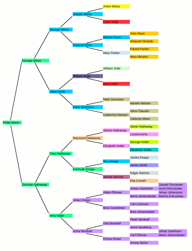
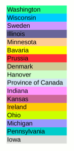
Mine is all over the map. After coming to America, most of my family didn’t stay long in one place before moving on for more opportunity. Sweden, Wisconsin, and Washington are the places with the largest number of people. Not surprisingly, those are the areas I’m most familiar with researching.
Additionally, all my German ancestors immigrated before German unification. They came from countries like the Kingdom of Hanover, Bavaria, and Prussia, which is more complex research than Denmark or Sweden. Each of those states that became part of the German empire recorded information differently. A couple of relatives were born in the Province of Canada, that short-lived colony that predated Ontario.
With this many places, a genealogist has to become familiar with a lot of locations. In some ways, I envy people whose families stayed in one area for generations. On the other hand, I get a much greater variety of stories.